Your event sold out. Congratulations. Now the finance director wants to know if it was actually worth doing, the sponsor wants proof their logo earned its keep, and you are staring at a dashboard that proudly tells you one thing: how many tickets you sold. That number felt great in June. It answers almost nothing in September. Good event reporting and analytics starts exactly where the ticket counter stops, and this is a guide to what you should be looking for once you stop treating "tickets sold" as the whole story.
Here is the short version in the first hundred words: tickets sold tells you people intended to come. It does not tell you whether they turned up, which sessions they valued, whether sponsors got what they paid for, or whether next year should be bigger, smaller, or shaped differently. The reports that actually change decisions measure attendance against registration, behaviour during the event, and outcomes afterwards. If your platform can only count sales, you are flying a plane with nothing but a fuel gauge.
Why ticket counts are the vanity metric of event reporting and analytics
Ticket sales are seductive because they are easy to count and they go up. That is also exactly why they mislead. A sold-out event with a 30% no-show rate is not the same as a sold-out event where everyone came, but the sales report shows them as identical. Registration is a promise. Attendance is the truth. Any reporting that stops at the promise is measuring optimism, not the event.
The industry has been drifting toward this for a while. Rather than leaning on headline registration figures, stronger post-event analysis now weighs operational signals such as attendee flow, session attendance patterns and engagement trends (fielddrive covers this well in its guide to event data analytics). The metrics that survive contact with a budget review are the ones that describe what really happened in the room, not what people clicked three months earlier.
Registration is a promise. Attendance is the truth. Reporting that stops at the sale is measuring optimism.
The numbers worth reporting on
If ticket counts are the floor, here is the ceiling. These are the figures that tell you something you can act on next time, grouped by the question they answer.
| What you want to know | The metric that answers it | Why ticket counts miss it |
|---|---|---|
| Did they actually come? | Attendance rate and no-show rate | Sales count promises, not arrivals |
| When did they arrive? | Check-in timings across the day | Sales say nothing about the door |
| What did they value? | Session or track attendance | One ticket hides many choices |
| Did sponsors get value? | Booth traffic and lead capture | Sales ignore the sponsor entirely |
| Should we do it again? | Repeat rate and year-on-year trend | A single sales figure has no context |
The no-show rate deserves a special mention because it is the cheapest insight in events and the most ignored. Comparing registrations against actual arrivals tells you how accurate your turnout really is, and once you track it you can attack it with reminders, waitlists and better scheduling. Without it, you keep catering and staffing for the promise instead of the reality, and you pay for empty chairs every single time.
Attendance data you can only get at the door
Most of the reporting that matters is captured in the ninety seconds a person spends checking in, which is exactly why it goes missing so often. If your door runs on a paper list or a separate app that never talks to your registration data, the real attended figure ends up on a clipboard and gets rounded into the post-event report from memory. That is how a 78% attendance rate quietly becomes "we were basically full".
Run the Whole Event From One Platform
Ticketing, registration, promotions and check-in together, so the plan and the tools finally match.
When check-in feeds the same record as registration, the attended number, the no-show rate and the arrival curve are all captured automatically as people walk in. You learn that 40% of your crowd arrived in one fifteen-minute crush, which tells you to open more lanes next year. You learn which ticket types actually showed up, which sharpens your marketing. None of that requires anyone to type anything after the event. You can see how check-in feeds straight into the event record rather than a stray spreadsheet that someone has to reconcile later.

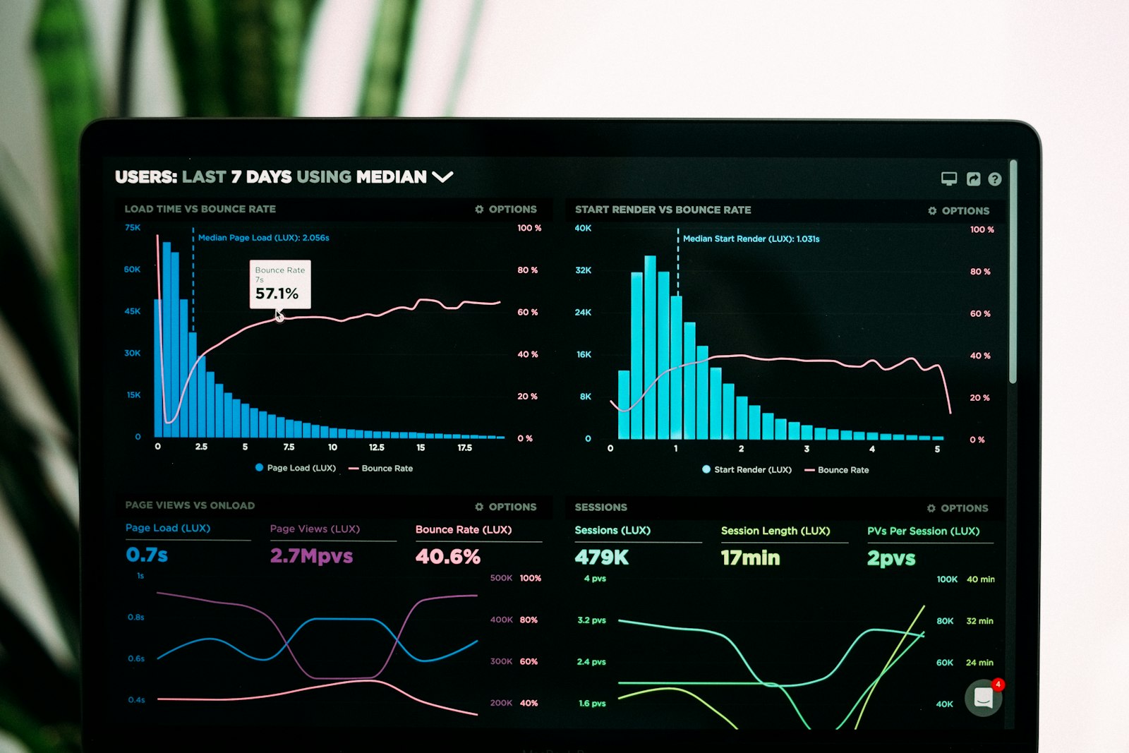
The goal: a report that answers the finance director, not just the ticket counter. Credit: Lukas Blazek / Unsplash
Making reports sponsors and finance will actually respect
Two audiences will read your event report harder than you do: the sponsor deciding whether to renew, and finance deciding whether to fund it again. Both want the same thing, which is proof of outcome rather than proof of activity.
For sponsors, that means moving past "we had 1,200 registrations" to what their money bought: how many attendees visited their booth, how many leads were captured, which sessions their target audience actually sat in. Sponsor value now gets measured through booth visits, interaction time and qualified leads rather than a logo impression count, and a renewal conversation backed by that data is a far shorter meeting than one backed by a headcount and a hopeful smile.
For finance, the winning number is cost against outcome: cost per attendee who actually showed, not cost per ticket sold, plus the year-on-year trend that shows whether the event is improving or just repeating. This is where a lot of teams come unstuck, because the numbers live in four systems and assembling them takes a week. If registration, check-in and reporting sit in one place, the sponsor pack and the finance summary are exports, not archaeology. That single-source setup is the whole idea behind the eventcloud platform: the event is the record, so the reporting is already done when the event ends.
What good event reporting and analytics looks like in practice
You do not need an agentic AI dashboard or a data science hire to do this well, although real-time reporting tools are genuinely getting faster at surfacing insights mid-event. You need a short list of metrics that map to decisions, captured automatically so nobody has to rekey them, and stored where you can line up this year against last year.
A practical starter set: attendance rate and no-show rate for the whole event, arrival timings across the day, attendance per session or track, sponsor booth traffic and leads where relevant, and a repeat-attendance figure once you have run the event more than once. Report those six well and you will make better decisions than a team drowning in fifty vanity charts. Honesty check: if you run tiny, one-off free events, a full analytics suite is overkill and a simple attendance tally is fine. This matters most when you run events regularly and need each one to inform the next.
The test is simple. When someone asks whether last year's event was worth it, you should be able to answer with attendance, outcome and trend in under a minute, from one trusted place. If your honest answer is still "well, we sold a lot of tickets", the reporting is not doing its job yet. If you would rather your numbers arrived that way by default, take a look at how eventcloud keeps registration, check-in and reporting together so the report writes most of itself.